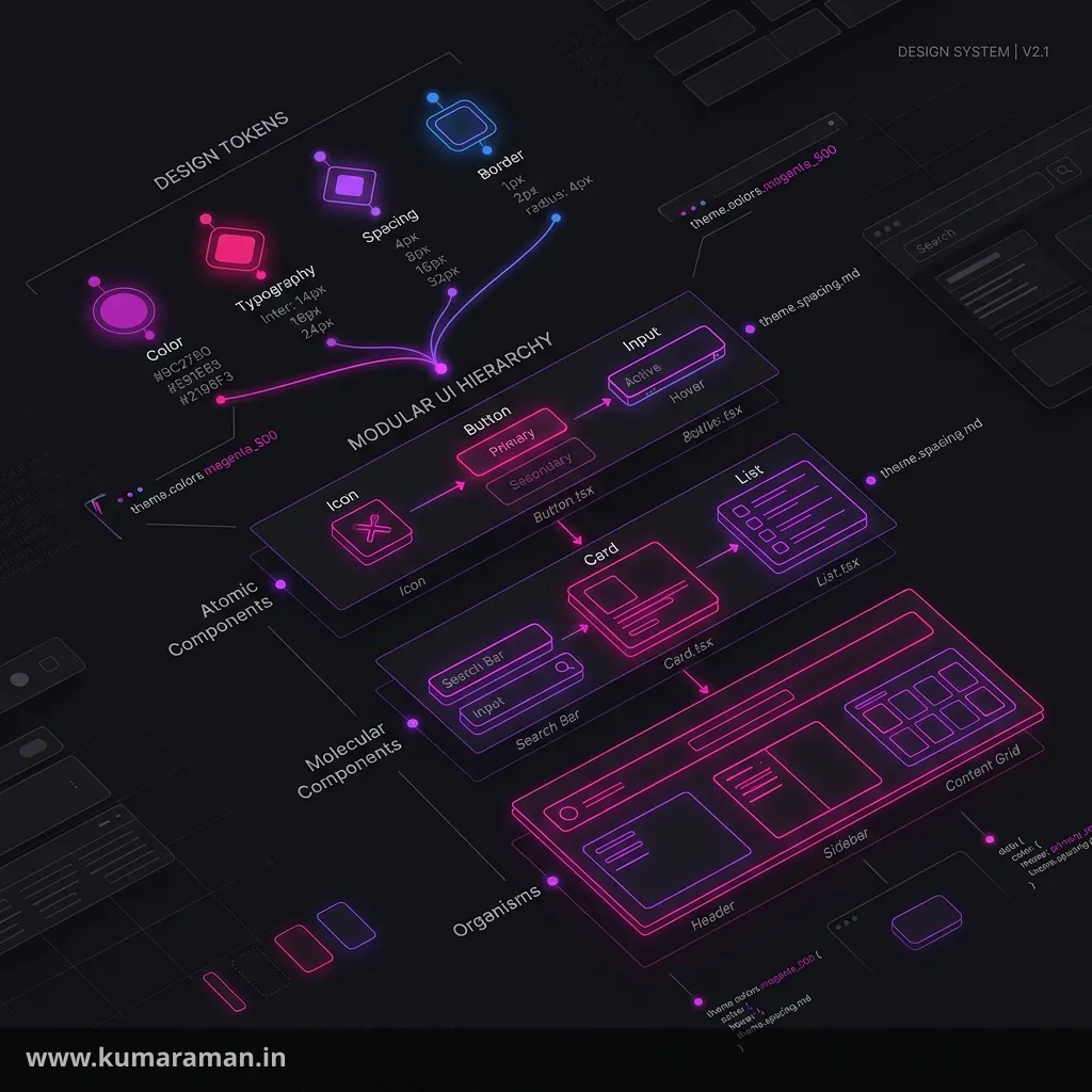
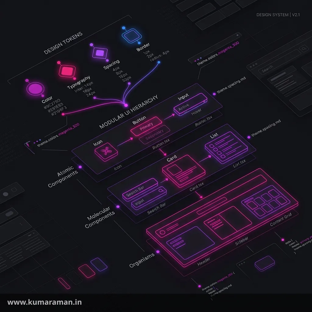
Almost every modern AEM Sites project is built on the Core Components. Title, Text, Image, Teaser, Container, Navigation, the Page component itself: on a typical project, most of what authors drop onto a page is a Core Component with a thin layer of project code on top. Used well, they give you accessible, analytics-ready, JSON-exportable components that Adobe maintains for you. Used badly, with overlays, forked HTL, and content that points straight at Adobe's resource types, they turn every upgrade into a migration project.
This guide covers the parts you actually need to get right. It explains what Core Components are and how they're versioned, why the proxy component pattern matters, how editable templates and policies configure them, how the Style System gets a CSS class from a policy onto the page, and the supported ways to extend them: dialog merging, Sling Model delegation, and HTL overrides. It also covers the data layer, accessibility, upgrades, and how delivery differs between AEM as a Cloud Service and AEM 6.5. A cheat sheet, best practices, and do's & don'ts close it out.
This post goes deeper than the Core Components section of the Component Development guide, which covers dialogs, Sling Models, and HTL in general. The HTL cheat sheet and Annotations reference are useful companions. For client libraries and the front-end build, see the Frontend Integration guide. If you want boilerplate for a new component, the AEM Component Generator produces the HTL, dialog, and Sling Model for you.
What Core Components are (and why they exist)
Core Components are a set of standardized WCM components that Adobe develops in the open at github.com/adobe/aem-core-wcm-components under the Apache 2.0 license. They replaced the old JSP-based foundation components, and they're built the way Adobe recommends you build your own components:
- Logic in Sling Models (Java interfaces in
com.adobe.cq.wcm.core.components.models, with private implementations). - Markup in HTL, which escapes output for XSS protection by default.
- Configuration through policies, so template authors decide which features page authors get.
- BEM-style CSS classes (
cmp-title,cmp-title__text) and Style System support. - JSON export through the Sling Model Exporter, for headless and SPA use.
- Data layer integration with the Adobe Client Data Layer.
The release line at the time of writing is 2.32.x (2.32.8 shipped in September 2026). The repository is a Maven reactor, and it ships as a few artifacts you'll see in project POMs:
| Artifact | What it contains |
|---|---|
core.wcm.components.core | The OSGi bundle: model interfaces, implementations, servlets |
core.wcm.components.content | The components themselves (HTL, dialogs, clientlibs) as a content package |
core.wcm.components.config | OSGi configurations the components depend on |
core.wcm.components.all | A container package bundling the above |
The one hard requirement is editable templates. Core Components don't support static templates or the Classic UI. If you're migrating an older estate, Adobe points to the community-maintained AEM Modernize Tools, which convert static templates, design configurations, and foundation components.
The component catalog
The Core Components README lists 30 components in four categories. The version shown is the latest major version in the repository today, which is the one a new proxy should point at.
| Category | Component | Latest | Resource type |
|---|---|---|---|
| Template | Page | v3 | core/wcm/components/page/v3/page |
| Template | Navigation | v2 | core/wcm/components/navigation/v2/navigation |
| Template | Language Navigation | v2 | core/wcm/components/languagenavigation/v2/languagenavigation |
| Template | Breadcrumb | v3 | core/wcm/components/breadcrumb/v3/breadcrumb |
| Template | Quick Search | v3 | core/wcm/components/search/v3/search |
| Template | Content AI Search | v1 | core/wcm/components/contentaisearch/v1/contentaisearch |
| Template | Table of Contents | v1 | core/wcm/components/tableofcontents/v1/tableofcontents |
| Authoring | Title | v3 | core/wcm/components/title/v3/title |
| Authoring | Text | v2 | core/wcm/components/text/v2/text |
| Authoring | Image | v3 | core/wcm/components/image/v3/image |
| Authoring | Button | v2 | core/wcm/components/button/v2/button |
| Authoring | Teaser | v2 | core/wcm/components/teaser/v2/teaser |
| Authoring | List | v4 | core/wcm/components/list/v4/list |
| Authoring | Download | v2 | core/wcm/components/download/v2/download |
| Authoring | PDF Viewer | v1 | core/wcm/components/pdfviewer/v1/pdfviewer |
| Authoring | Embed | v2 | core/wcm/components/embed/v2/embed |
| Authoring | Progress Bar | v1 | core/wcm/components/progressbar/v1/progressbar |
| Authoring | Separator | v1 | core/wcm/components/separator/v1/separator |
| Authoring | Experience Fragment | v2 | core/wcm/components/experiencefragment/v2/experiencefragment |
| Authoring | Content Fragment | v1 | core/wcm/components/contentfragment/v1/contentfragment |
| Authoring | Content Fragment List | v2 | core/wcm/components/contentfragmentlist/v2/contentfragmentlist |
| Container | Container | v1 | core/wcm/components/container/v1/container |
| Container | Carousel | v1 | core/wcm/components/carousel/v1/carousel |
| Container | Tabs | v1 | core/wcm/components/tabs/v1/tabs |
| Container | Accordion | v1 | core/wcm/components/accordion/v1/accordion |
| Form | Form Container | v2 | core/wcm/components/form/container/v2/container |
| Form | Form Text | v2 | core/wcm/components/form/text/v2/text |
| Form | Form Options | v2 | core/wcm/components/form/options/v2/options |
| Form | Form Hidden | v2 | core/wcm/components/form/hidden/v2/hidden |
| Form | Form Button | v2 | core/wcm/components/form/button/v2/button |
The Social Media Sharing component (sharing/v1) is still in the repository but has been flagged cq:deprecated since Core Components 2.18.0 with the reason "Should not be used in new projects". Leave it out of new builds.
Note: The Content Fragment and Experience Fragment components are covered in depth in the Content Fragments & Experience Fragments guide. This post focuses on the mechanics every Core Component shares.
Versioning: release versions vs component versions
Core Components carry two independent version numbers, and mixing them up causes a lot of confusion.
- The release version (for example
2.32.8) is the Maven version of the whole library. It follows semantic versioning, and on AEM 6.5 it's what you bump in your POM. - The component version is the
v1,v2, orv3baked into the resource type path, such ascore/wcm/components/title/v3/title. Client library categories follow the same scheme (core.wcm.components.image.v3).
A single release ships several component versions side by side (2.32.x contains Title v1, v2, and v3). Adobe only introduces a new component major version for backward-incompatible changes. According to the Core Components guidelines, that means incompatible changes to any of the following:
- Sling Models (following semantic versioning)
- HTL scripts and templates
- HTML markup and CSS selectors
- the JSON representation
- dialogs
The practical consequence: a release upgrade within the same component version shouldn't break your markup or your customizations. A component major upgrade (Title v2 to v3) can, which is why you opt into it deliberately, one component at a time.
Each implementation (for example ...internal.models.v1.TitleImpl) binds itself to its resource types, while the HTL adapts to the interface:
<div data-sly-use.title="com.adobe.cq.wcm.core.components.models.Title"
     data-cmp-data-layer="${title.data.json}"
     id="${title.id}"
     class="cmp-title">
    <h1 class="cmp-title__text" data-sly-element="${title.type}">${title.text}</h1>
</div>
Sling Models picks the implementation registered for the current resource type. Adobe calls this double binding the model interface pattern, and it's what lets you swap in your own implementation later without touching the HTL.
The proxy component pattern
Here's the rule the whole system depends on: content must never reference a Core Component's resource type directly. Instead, you create a site-specific proxy component in /apps that inherits from the Core Component through sling:resourceSuperType, and authors only ever use the proxy.
<?xml version="1.0" encoding="UTF-8"?>
<!-- /apps/mysite/components/title/.content.xml -->
<jcr:root xmlns:sling="http://sling.apache.org/jcr/sling/1.0"
          xmlns:cq="http://www.day.com/jcr/cq/1.0"
          xmlns:jcr="http://www.jcp.org/jcr/1.0"
    jcr:primaryType="cq:Component"
    jcr:title="Title"
    jcr:description="Section heading"
    sling:resourceSuperType="core/wcm/components/title/v3/title"
    componentGroup="My Site - Content"/>
That's a complete, working component. Sling resolves scripts, dialogs, and models by walking up the super-type chain, so an empty proxy behaves exactly like the Core Component. A few details are worth understanding.
Why the content must not contain a version number. Each content node stores its sling:resourceType. If a page's title node says core/wcm/components/title/v2/title, moving to v3 means rewriting that property on every title node in the repository. If it says mysite/components/title, moving to v3 is a one-line change to the proxy's sling:resourceSuperType. Adobe's guidance puts it bluntly: a content resource's sling:resourceType should never contain a version number.
Why you use relative resource types, never /libs or /apps paths. sling:resourceSuperType should be the relative path core/wcm/components/.... Sling resolves it against its search paths (/apps, then /libs). That matters because the Core Components live in different places on the two platforms: under /libs/core/wcm/components on AEM as a Cloud Service, and under /apps/core/wcm/components when you install them yourself on AEM 6.5. A relative type works on both, but a hardcoded absolute path breaks as soon as the code moves between them.
Why authors can't see Core Components directly. Every Core Component sits in a hidden component group, .core-wcm or .core-wcm-form. A group name that starts with a dot is hidden from the editor's component browser, so the proxy's componentGroup is what authors actually see.
Some Core Components delegate to another component internally, and the proxy is where you redirect that. The Teaser, for instance, renders its image through an image component named by the imageDelegate property. The AEM Project Archetype sets it to the project's own Image proxy:
<jcr:root xmlns:sling="http://sling.apache.org/jcr/sling/1.0"
          xmlns:cq="http://www.day.com/jcr/cq/1.0"
          xmlns:jcr="http://www.jcp.org/jcr/1.0"
    jcr:primaryType="cq:Component"
    jcr:title="Teaser"
    sling:resourceSuperType="core/wcm/components/teaser/v2/teaser"
    componentGroup="My Site - Content"
    imageDelegate="mysite/components/image"/>
Important: Adobe's Cloud Service docs are explicit that even though the Core Components are in
/libs, you should not overlay/apps/core/wcm/components/.... Anything you'd customize belongs in your proxy. An overlay silently replaces Adobe's file for every site on the instance and gets out of step with each automatic update.
Editable templates and policies
Core Components are configured through editable templates, which live under /conf/<site>/settings/wcm/templates. Each template has three parts:
- structure: components forced onto every page (header, footer, the root container), which authors can't delete unless they're unlocked.
- initial: content copied into a new page when it's created.
- policies: a mapping from each component position to a content policy.
A policy is a component's pre-configuration: what a template author sets in the component's design dialog. Policies live under /conf/<site>/settings/wcm/policies, keyed by component resource type, so the same policy can be reused across templates. The template's policies node points at them with cq:policy:
<!-- /conf/mysite/settings/wcm/templates/article/policies/.content.xml (excerpt) -->
<jcr:content
    jcr:primaryType="nt:unstructured"
    sling:resourceType="wcm/core/components/policies/mappings">
    <root
        jcr:primaryType="nt:unstructured"
        cq:policy="mysite/components/container/policy_root"
        sling:resourceType="wcm/core/components/policies/mapping">
        <container
            jcr:primaryType="nt:unstructured"
            cq:policy="mysite/components/container/policy_main"
            sling:resourceType="wcm/core/components/policies/mapping"/>
    </root>
</jcr:content>
Policies control a surprising amount of behavior. For the Title v3 component, the policy's type property sets the default heading level and linkDisabled turns off linking. The Image v3 policy controls lazy loading (disableLazyLoading), Dynamic Media features (enableDmFeatures), and delivery through Cloud Service's Asset Delivery system (enableAssetDelivery). The container policy decides which components are allowed inside it. This is why Core Components need so few dialog customizations: the "variant" logic that used to require a new component is usually a policy toggle.
Allowing components is the final step of any Core Components setup. In the Template Editor, select the layout container, open its policy, and tick your proxy components (they appear under the componentGroup you gave them).
Tip: Treat
/conftemplates and policies as code. Build them in the Template Editor on a local instance, then pull them intoui.contentand deploy them through your pipeline. Hand-editing policies directly on production author is how environments drift apart.
The Style System
The Style System lets a template author define named CSS classes in a component's policy, and lets a page author pick them from a Styles (paintbrush) menu on the component toolbar. It's how you give authors "Dark", "Centered", or "Hero" variants of a component without building a new component or adding a dialog field for each one.
The workflow splits cleanly: front-end developers write the CSS (and optional JS) for each variant, the AEM developer ships it in a client library and adds the class names to policies, and authors pick them. The CSS itself can be built and tested entirely outside AEM.
Note: The Style System only applies to pages created with the Page Editor. Pages built with the Universal Editor and served through Edge Delivery Services are styled through the project's code instead. See the Edge Delivery Services guide.
What's stored in the JCR
When a template author fills in the Styles tab of a policy, AEM writes a cq:styleGroups node under that policy. This excerpt follows the structure Adobe's WKND reference site uses for its Title policy:
<!-- under /conf/mysite/settings/wcm/policies/mysite/components/title/... -->
<policy_title_article
    jcr:primaryType="nt:unstructured"
    jcr:title="Article Title"
    sling:resourceType="wcm/core/components/policy/policy"
    type="h2">
    <cq:styleGroups jcr:primaryType="nt:unstructured">
        <item0
            jcr:primaryType="nt:unstructured"
            cq:styleGroupLabel="Decoration"
            cq:styleGroupMultiple="{Boolean}true">
            <cq:styles jcr:primaryType="nt:unstructured">
                <item0
                    jcr:primaryType="nt:unstructured"
                    cq:styleId="1568996484405"
                    cq:styleLabel="Underline"
                    cq:styleClasses="cmp-title--underline"/>
                <item1
                    jcr:primaryType="nt:unstructured"
                    cq:styleId="1570766394721"
                    cq:styleLabel="Mini spacing"
                    cq:styleClasses="cmp-title--minispacing"/>
            </cq:styles>
        </item0>
        <item1
            jcr:primaryType="nt:unstructured"
            cq:styleGroupLabel="Color">
            <cq:styles jcr:primaryType="nt:unstructured">
                <item0
                    jcr:primaryType="nt:unstructured"
                    cq:styleId="1568996420379"
                    cq:styleLabel="Black"
                    cq:styleClasses="cmp-title--black"/>
                <item1
                    jcr:primaryType="nt:unstructured"
                    cq:styleId="1568996427017"
                    cq:styleLabel="White"
                    cq:styleClasses="cmp-title--white"/>
            </cq:styles>
        </item1>
    </cq:styleGroups>
</policy_title_article>
The properties map directly to the fields in the policy dialog:
| Property | Where | Meaning |
|---|---|---|
cq:styleGroupLabel | group | Group name shown in the Styles menu |
cq:styleGroupMultiple | group | "Styles can be combined": allow several styles from this group at once |
cq:styleLabel | style | Author-facing name of the style |
cq:styleClasses | style | The CSS class(es) actually applied |
cq:styleId | style | Stable ID that content references |
cq:styleElement | style | Optional wrapper element name for this style |
cq:styleDefaultClasses | policy | Classes applied when the author picks nothing |
cq:styleDefaultElement | policy | Default wrapper element name |
When an author picks a style, the content doesn't store the class name. It stores the style's ID in a cq:styleIds string array on the component's node. That indirection is useful: rename a class in the policy and every component using that style picks up the new class. The trade-off is that deleting a style from a policy (or recreating it with a new ID) quietly orphans every component that referenced the old ID. The content still holds the ID, but nothing is applied anymore.
Where the class lands
AEM wraps every editable component in a decoration element, and the Style System puts the selected classes on that wrapper, not on the component's own root element. For a Title inside a layout container, the rendered markup looks roughly like this:
<div class="title cmp-title--underline cmp-title--black aem-GridColumn aem-GridColumn--default--12">
    <div class="cmp-title">
        <h2 class="cmp-title__text">Our story</h2>
    </div>
</div>
The wrapper also carries a class named after the component (title) and, inside a responsive grid, the layout classes. The component's own markup starts at .cmp-title. This is why the component developer "doesn't need to do anything" for the Style System to work: the classes are applied outside the component's HTL entirely.
It also explains the one CSS rule you must follow. Style classes are ancestors of the component's BEM block, so style selectors are written as descendant selectors:
// The style class sits on the wrapper, so target the block/elements inside it.
.cmp-title--underline {
  .cmp-title__text::after {
    content: "";
    display: block;
    width: 84px;
    padding-top: 8px;
    border-bottom: 2px solid $brand-primary;
  }
}

.cmp-title--white .cmp-title__text {
  color: $text-color-inverse;
}
Writing .cmp-title.cmp-title--white (both classes on the same element) is the classic mistake. It never matches, because the two classes are on different elements.
The wrapper element name can change too. A component can declare the elements it allows with cq:styleElements on its cq:Component node (for example [div,section,aside]), and the template author then picks one per style. That's how a generic Container becomes a main or an aside. When several sources set the element name, Adobe documents this priority: a decorationTagName passed in HTL wins. Next comes the first active style in the policy's order, and then the component's cq:htmlTag / cq:tagName as a fallback. Avoid setting element names on styles that can be combined.
BEM naming and combining styles
Core Components follow BEM conventions: the block is cmp-<name>, elements are cmp-<name>__<element>, and modifiers are cmp-<name>--<modifier>. Each component's README documents its exact BEM structure. Name your Style System classes as modifiers of the block (cmp-teaser--hero, cmp-teaser--dark) and you get self-documenting, collision-free CSS.
Design your style groups around the combination rules:
- Put mutually exclusive options (color themes, sizes) in a group without "Styles can be combined", so the menu behaves like radio buttons.
- Put independent options (underline, extra spacing, align right) in a group with it enabled, so they behave like checkboxes.
- Make sure combinable styles don't fight over the same CSS properties. If "Hero" and "Compact" both set padding, their order in the stylesheet decides the winner, and authors will call it a bug.
Enabling the Style System on your own components
Core Components v2 and later support the Style System out of the box, and so does any proxy of them. For a custom component, you add the Styles tab to its design dialog by including Adobe's tab:
<!-- _cq_design_dialog/.content.xml, inside content/items/tabs/items -->
<styletab
    jcr:primaryType="nt:unstructured"
    sling:resourceType="granite/ui/components/coral/foundation/include"
    path="/mnt/overlay/cq/gui/components/authoring/dialog/style/tab_design/styletab"/>
There's an optional edit dialog equivalent (.../style/tab_edit/styletab) that gives authors a Styles tab inside the component dialog as an alternative to the toolbar menu. It's not enabled by default, and it isn't required for the Style System to work.
Reading applied styles in Java
Occasionally logic needs to know which style is active (to pick an image rendition for a "hero" style, say). Don't parse cq:styleIds yourself. The Core Components' Component interface exposes getAppliedCssClasses(), which returns the author-selected classes as a space-delimited string. The JSON exporter emits the same value as appliedCssClassNames, which is how SPA front ends apply Style System classes. Under the hood it adapts the resource to AEM's com.adobe.cq.wcm.style.ComponentStyleInfo, which you can also use directly in a custom model:
ComponentStyleInfo styleInfo = resource.adaptTo(ComponentStyleInfo.class);
String classes = styleInfo != null ? styleInfo.getAppliedCssClasses() : null;
boolean isHero = classes != null && classes.contains("cmp-teaser--hero");
Extending Core Components
Adobe's customization guide describes a ladder of techniques. Start at the top and only go further down when the level above really can't do what you need. Each step down adds upgrade risk.
| Need | Technique | Upgrade risk |
|---|---|---|
| Visual variation | CSS + Style System | None |
| Turn features on/off per template | Policy (design dialog) | None |
| Hide, replace, or add dialog tabs | Sling Resource Merger on the proxy's dialog | Low |
| Change or add business logic | Sling Model delegation | Low to medium |
| Change the HTML structure | Copy HTL into the proxy | Highest |
And one rule sits above the table: never modify Core Component code directly. That includes overlays of core/wcm/components. Adobe's support doesn't cover it, and it makes every update painful.
Customizing dialogs with the Sling Resource Merger
A proxy that defines its own _cq_dialog doesn't replace the Core dialog. The Sling Resource Merger merges the two along the super-type chain, so you only declare the differences. It gives you a small set of control properties:
| Property | Effect |
|---|---|
sling:hideResource | Hide an inherited node (e.g. a whole tab) |
sling:hideChildren | Hide listed inherited children (* hides all) |
sling:hideProperties | Hide listed inherited properties |
sling:orderBefore | Place this node before the named sibling |
Adobe's guidance is specific about where to make changes. Replicate the dialog's node structure down to the tab level, and make your changes there: hide whole tabs and add new tabs. Don't hide, reorder, or inject individual fields below tab level, because Adobe may restructure a tab's internals in a minor release and your merged paths would stop matching.
Here's a Teaser proxy that adds a "Campaign" tab ahead of the Styles tab and hides the Links tab. The tab node names (actions, text, image, styletab) come from the Teaser v2 dialog in the repository:
<?xml version="1.0" encoding="UTF-8"?>
<!-- /apps/mysite/components/teaser/_cq_dialog/.content.xml -->
<jcr:root xmlns:sling="http://sling.apache.org/jcr/sling/1.0"
          xmlns:jcr="http://www.jcp.org/jcr/1.0"
          xmlns:nt="http://www.jcp.org/jcr/nt/1.0"
    jcr:primaryType="nt:unstructured">
    <content jcr:primaryType="nt:unstructured">
        <items jcr:primaryType="nt:unstructured">
            <tabs jcr:primaryType="nt:unstructured">
                <items jcr:primaryType="nt:unstructured">
                    <actions
                        jcr:primaryType="nt:unstructured"
                        sling:hideResource="{Boolean}true"/>
                    <campaign
                        jcr:primaryType="nt:unstructured"
                        jcr:title="Campaign"
                        sling:orderBefore="styletab"
                        sling:resourceType="granite/ui/components/coral/foundation/container"
                        margin="{Boolean}true">
                        <items jcr:primaryType="nt:unstructured">
                            <campaignCode
                                jcr:primaryType="nt:unstructured"
                                sling:resourceType="granite/ui/components/coral/foundation/form/textfield"
                                fieldLabel="Campaign code"
                                fieldDescription="Tracking code shown as the pretitle when none is authored"
                                name="./campaignCode"/>
                        </items>
                    </campaign>
                </items>
            </tabs>
        </items>
    </content>
</jcr:root>
The Resource Merger works the same on 6.5 and Cloud Service. Adobe also recommends Granite UI hide conditions alongside the Resource Merger when a field should only appear in some contexts.
Extending logic with Sling Model delegation
The Core model implementations are in internal packages. They aren't exported, so you can't extend them, only their interfaces. Customization therefore uses delegation: your model implements the same interface, registers itself for your proxy's resource type, and gets the Core model injected to handle everything you don't override.
The injection is done with @Self @Via(type = ResourceSuperType.class). This Sling Models feature (added by SLING-6778) adapts the request again, but with the resource type swapped for the resource's super type, so you get exactly the model the Core Component would have used:
package com.mysite.core.models;

import java.util.List;

import org.apache.commons.lang3.StringUtils;
import org.apache.sling.api.SlingHttpServletRequest;
import org.apache.sling.api.resource.Resource;
import org.apache.sling.models.annotations.DefaultInjectionStrategy;
import org.apache.sling.models.annotations.Exporter;
import org.apache.sling.models.annotations.Model;
import org.apache.sling.models.annotations.Via;
import org.apache.sling.models.annotations.injectorspecific.Self;
import org.apache.sling.models.annotations.injectorspecific.ValueMapValue;
import org.apache.sling.models.annotations.via.ResourceSuperType;

import com.adobe.cq.export.json.ComponentExporter;
import com.adobe.cq.export.json.ExporterConstants;
import com.adobe.cq.wcm.core.components.commons.link.Link;
import com.adobe.cq.wcm.core.components.models.ListItem;
import com.adobe.cq.wcm.core.components.models.Teaser;
import com.adobe.cq.wcm.core.components.models.datalayer.ComponentData;

@Model(
    adaptables = SlingHttpServletRequest.class,
    adapters = {Teaser.class, ComponentExporter.class},
    resourceType = CampaignTeaser.RESOURCE_TYPE,
    defaultInjectionStrategy = DefaultInjectionStrategy.OPTIONAL)
@Exporter(
    name = ExporterConstants.SLING_MODEL_EXPORTER_NAME,
    extensions = ExporterConstants.SLING_MODEL_EXTENSION)
public class CampaignTeaser implements Teaser {

    static final String RESOURCE_TYPE = "mysite/components/teaser";

    /** The Core Teaser model, resolved through the proxy's sling:resourceSuperType. */
    @Self
    @Via(type = ResourceSuperType.class)
    private Teaser delegate;

    @ValueMapValue
    private String campaignCode;

    // --- The one behavior we change ---
    @Override
    public String getPretitle() {
        String pretitle = delegate.getPretitle();
        return StringUtils.isNotBlank(pretitle) ? pretitle : campaignCode;
    }

    // --- New API for our own HTL ---
    public String getCampaignCode() {
        return campaignCode;
    }

    // --- Everything else is delegated explicitly ---
    @Override public String getTitle() { return delegate.getTitle(); }
    @Override public String getDescription() { return delegate.getDescription(); }
    @Override public String getTitleType() { return delegate.getTitleType(); }
    @Override public boolean isTitleLinkHidden() { return delegate.isTitleLinkHidden(); }
    @Override public boolean isImageLinkHidden() { return delegate.isImageLinkHidden(); }
    @Override public boolean isActionsEnabled() { return delegate.isActionsEnabled(); }
    @Override public List<ListItem> getActions() { return delegate.getActions(); }
    @Override public Link getLink() { return delegate.getLink(); }
    @Override public Resource getImageResource() { return delegate.getImageResource(); }
    @Override public String getId() { return delegate.getId(); }
    @Override public ComponentData getData() { return delegate.getData(); }
    @Override public String getAppliedCssClasses() { return delegate.getAppliedCssClasses(); }

    @Override
    public String getExportedType() {
        // The delegate would report the Core super type; report our proxy instead.
        return RESOURCE_TYPE;
    }
}
Because the HTL uses data-sly-use.teaser="com.adobe.cq.wcm.core.components.models.Teaser" (the interface), Sling Models now resolves your implementation for mysite/components/teaser. The Core HTL renders your pretitle without being copied.
A few traps catch almost everyone the first time:
- Every Core interface method is a
defaultmethod. The defaults returnnullorfalse. If you forget to delegate a method, it compiles fine and silently returnsnull: the image vanishes, or the data layer entry disappears. Delegate every method the HTL or JSON uses, and re-check the interface when you upgrade, because new releases add new default methods. getExportedType()on the delegate returns the Core super type. Override it if a SPA front end maps components by type.- The proxy must declare
sling:resourceSuperType.@Via(type = ResourceSuperType.class)has nothing to resolve without it. - Unit test the model. AEM Mocks can load a Core Component model from the
core.wcm.components.coretest dependency. See the Unit Testing guide.
Overriding the HTL
When CSS can't achieve a design (you need an extra element, or a different order), copy the Core HTL file you need to change into the proxy under the same file name. Sling's script resolution finds the proxy's file first, before the super type's. For the Teaser, you'd copy teaser.html into /apps/mysite/components/teaser/ and edit it. The Teaser also splits its markup into small template files (pretitle.html, title.html, description.html, actions.html, image.html), so look at the structure before deciding how much to copy.
This is the most upgrade-sensitive customization, because your copy freezes that markup at the version you copied. When a release fixes an accessibility issue or adds a data layer attribute in that file, you don't get the fix. Keep a comment in the copied file recording the Core release and component version it came from, keep the BEM class names unchanged so the Style System CSS keeps working, and diff your copy against upstream on every upgrade.
<!--/* Copied from core/wcm/components/teaser/v2/teaser/teaser.html (Core Components 2.32.x).
       Change: campaign badge above the content. Re-diff on every Core upgrade. */-->
<div data-sly-use.teaser="com.adobe.cq.wcm.core.components.models.Teaser"
     data-sly-use.campaign="com.mysite.core.models.CampaignTeaser"
     ...>
    <span class="cmp-teaser__campaign" data-sly-test="${campaign.campaignCode}">${campaign.campaignCode}</span>
    ...
</div>
The Adobe Client Data Layer (briefly)
Since Core Components 2.9.0, the Adobe Client Data Layer (ACDL) is shipped with the Core Components as a client library. Projects generated from the AEM Project Archetype v24 and later have it switched on. It's controlled by a context-aware configuration, not an OSGi config:
/conf/mysite/sling:configs/com.adobe.cq.wcm.core.components.internal.DataLayerConfig
    enabled = true   (Boolean)

/content/mysite/jcr:content
    sling:configRef = /conf/mysite
When it's enabled, the body gets a data-cmp-data-layer-enabled attribute and the page pushes its data into window.adobeDataLayer. Supported components serialize their data into a data-cmp-data-layer attribute, and clickable elements carry data-cmp-clickable. The layer raises cmp:click on clicks, and cmp:show / cmp:hide when Accordion, Tabs, or Carousel panels change. Run adobeDataLayer.getState() in the browser console to inspect it.
Your own components can join in by exposing a getData() built with DataLayerBuilder and rendering data-cmp-data-layer="${model.data.json}". When you delegate, return the delegate's getData() (as the teaser above does) unless you deliberately want to change the payload. The full analytics and Target wiring is in the Analytics, Target & Data Layer guide.
Accessibility
Accessibility is one of the strongest reasons to use Core Components rather than rolling your own. The project README describes them as compliant with WCAG 2.1, with ARIA labels and keyboard navigation (Adobe's comparison table with the foundation components cites WCAG 2.0 AA). Concretely:
- Tabs render
role="tablist",role="tab", androle="tabpanel"witharia-controls/aria-labelledbywiring, plus an author-setaccessibilityLabel. Carousel has anaccessibilityLabeltoo. - Carousel autoplay can be paused, has pause/play buttons, and pauses automatically when the document is hidden.
- Image v3 makes authors choose: provide
alttext, inherit it from the DAM asset (altValueFromDAM), or mark the image decorative (isDecorative) so assistive technology ignores it. - Page v3 supports a "skip to main content" link driven by the
mainContentSelectorpage property (the ID of the main content element). - Title and Teaser let template authors control heading levels, so the page outline stays logical.
The components are accessible building blocks, not an accessible page. Your CSS can still break focus outlines or contrast, a copied HTL file can drop an ARIA attribute, and authors can still pick the wrong heading level. Keep every aria-* and role attribute when you copy HTL, and include Style System variants in accessibility testing.
The Component Library and the Components console
Two tools make Core Components easier to work with day to day:
- The Component Library at aemcomponents.dev shows every Core Component in its various configurations, with the rendered HTML and the JSON model output. It's the fastest way to see the markup you're styling and what a policy option changes.
- The Components console (Tools → General → Components, at
/libs/wcm/core/content/sites/components.html) lists every component installed on the instance, with its properties (title, group, super type), the policies defined for it and the templates using them, and live usage: the pages where the component appears. It answers "is anyone still using the old v1 proxy?" before you remove it.
How Core Components ship: Cloud Service vs AEM 6.5
This is where the two platforms differ most, and it changes your build.
| Aspect | AEM as a Cloud Service | AEM 6.5 / 6.5 LTS |
|---|---|---|
| Where they live | /libs/core/wcm/components (part of the product) | /apps/core/wcm/components (installed by you) |
| Which release | Always the latest; Adobe updates them with AEM | Whatever version your all package embeds |
| Your POM | No Core Components content in the build; compile against aem-sdk-api | Depend on and embed core.wcm.components.core, .content, .config |
| Upgrading | Automatic; you retest after AEM updates | Bump core.wcm.components.version and redeploy |
| Local dev | Included in the AEM SDK quickstart | Install via your all package (or Package Manager) |
On AEM as a Cloud Service, there's no install step. The components ship in /libs and Adobe keeps them on the latest release. Adobe's docs state that if your project embeds the Core Components again under /apps, the build pipeline logs a warning and ignores the embedded copy, and that a future release will make it a build failure. Treat it as an error now and remove the embed. When you move a project from 6.5 to Cloud Service, Adobe's advice is simply to remove the Core Components dependency from your POM and depend on aem-sdk-api. Your proxies keep working, because they point at a versioned super type that exists in /libs. More in the Cloud Service migration guide.
On AEM 6.5, the Core Components aren't part of a production-mode quickstart, so you ship them yourself. The AEM Project Archetype does this by embedding the three Core artifacts into the all package under a vendor-packages folder:
<!-- all/pom.xml (AEM 6.5 project), inside the filevault-package-maven-plugin <embeddeds> -->
<embedded>
    <groupId>com.adobe.cq</groupId>
    <artifactId>core.wcm.components.content</artifactId>
    <type>zip</type>
    <target>/apps/mysite-vendor-packages/application/install</target>
</embedded>
<embedded>
    <groupId>com.adobe.cq</groupId>
    <artifactId>core.wcm.components.core</artifactId>
    <target>/apps/mysite-vendor-packages/application/install</target>
</embedded>
<embedded>
    <groupId>com.adobe.cq</groupId>
    <artifactId>core.wcm.components.config</artifactId>
    <type>zip</type>
    <target>/apps/mysite-vendor-packages/application/install</target>
</embedded>
Check the compatibility matrix in the Core Components README before choosing a release. At the time of writing, releases 2.28.x through 2.32.x support AEM 6.5 LTS (from GA) and AEM 6.5 from service pack 6.5.21.0, on Java 8, 11, 17, and 21. Releases up to 2.25.x target older 6.5 service packs. On Cloud Service the support is simply "continual".
Important: Because Cloud Service updates Core Components under you, your safety net is tests, not version pinning. Make sure your proxies, delegating models, and copied HTL are covered by unit tests and UI tests that run in the Cloud Manager pipeline. A new
defaultinterface method or a markup change in a minor release should fail a test, not reach production quietly.
Upgrading Core Components
Upgrades come in three kinds, and Adobe's customization guide sets different expectations for each:
- Upgrading AEM itself. This shouldn't affect Core Components or your customizations, as long as the component versions support the new AEM version and your code doesn't use deprecated or removed APIs.
- A new Core release, same component versions (for example 2.31 to 2.32). This shouldn't affect customizations built with the documented patterns (proxies, dialog merging above the field level, delegation). It's routine on 6.5 and automatic on Cloud Service.
- A new component major version (Title v2 to v3). Content structure stays compatible, but your customizations may need refactoring. Adobe publishes change logs per component version for this.
A safe playbook for a component major upgrade:
- Read the new version's README in the repository. Note BEM changes, dialog changes, removed policy options, and new interface methods.
- Point the proxy's
sling:resourceSuperTypeat the new version on a branch. - Re-check any delegating model: the Core model interface is shared across versions, but the new version's implementation may behave differently or use methods you never delegated.
- Diff any copied HTL against the new version's file and port your change onto the new markup (don't port the old markup forward).
- Update client library embeds (
core.wcm.components.image.v2becomescore.wcm.components.image.v3) and any CSS that relied on changed selectors. - Revisit policies: new versions may add options (like Image v3's Asset Delivery option) or read existing ones differently.
- Test with real content. No content migration is needed, because content only references
mysite/components/....
Tip: You don't have to upgrade every component at once. Each proxy chooses its own version, so you can move the Image to v3 this sprint and the List to v4 next quarter.
Cheat sheet
| Need | Where / what |
|---|---|
| Source and releases | github.com/adobe/aem-core-wcm-components (2.32.x line) |
| Resource type pattern | core/wcm/components/<name>/v<N>/<name> |
| Proxy component | cq:Component in /apps/<site>/components with sling:resourceSuperType + componentGroup |
| Hidden Core groups | .core-wcm, .core-wcm-form |
| Templates | /conf/<site>/settings/wcm/templates |
| Policies | /conf/<site>/settings/wcm/policies |
| Policy mapping | cq:policy on wcm/core/components/policies/mapping nodes |
| Style definitions | cq:styleGroups → cq:styles → cq:styleClasses / cq:styleId |
| Selected styles on content | cq:styleIds (String array of IDs) |
| Default style / element | cq:styleDefaultClasses, cq:styleDefaultElement on the policy |
| Allowed wrapper elements | cq:styleElements on the cq:Component |
| Style tab (design dialog) | include /mnt/overlay/cq/gui/components/authoring/dialog/style/tab_design/styletab |
| Applied classes in Java | Component#getAppliedCssClasses() or ComponentStyleInfo |
| Hide inherited dialog node | sling:hideResource="{Boolean}true" |
| Reorder dialog tab | sling:orderBefore="<sibling>" |
| Delegate to Core model | @Self @Via(type = ResourceSuperType.class) |
| Data layer toggle | CA config com.adobe.cq.wcm.core.components.internal.DataLayerConfig → enabled |
| Component Library | aemcomponents.dev |
| Components console | Tools → General → Components |
| Cloud Service location | /libs/core/wcm/components (don't embed, don't overlay) |
| AEM 6.5 location | /apps/core/wcm/components (embed in all) |
Best practices
- ✅ Create a proxy for every Core Component you use, per site, and let content reference only proxies.
- ✅ Use relative super types (
core/wcm/components/...), never absolute/libsor/appspaths. - ✅ Point new proxies at the latest component version and upgrade old ones deliberately, one at a time.
- ✅ Reach for CSS + Style System and policies before touching dialogs, models, or HTL.
- ✅ Name style classes as BEM modifiers (
cmp-<name>--<variant>) and write them as descendant selectors of the wrapper. - ✅ Split style groups into exclusive and combinable sets, and keep combinable styles from fighting over the same properties.
- ✅ Customize logic with delegation, delegating every interface method explicitly.
- ✅ Keep templates and policies in
/confunder source control and deploy them through the pipeline. - ✅ On Cloud Service, back your customizations with automated tests, because Core updates arrive without a POM change.
Do's and Don'ts
Do
- ✅ Do keep version numbers out of content. Only the proxy knows the version.
- ✅ Do record the source release in any copied HTL and diff it on every upgrade.
- ✅ Do override
getExportedType()in delegating models used by SPA front ends. - ✅ Do include your Style System variants in accessibility testing.
- ✅ Do remove the Core Components embed from your build when moving to Cloud Service.
Don't
- ❌ Don't overlay or edit anything under
core/wcm/components, in/libsor/apps. - ❌ Don't let authors use Core Components directly or unhide the
.core-wcmgroups. - ❌ Don't hide or reorder dialog fields below tab level. Hide and add whole tabs instead.
- ❌ Don't write
.cmp-title.cmp-title--dark. The style class is on the wrapper, not the block. - ❌ Don't delete or recreate styles in a live policy without checking which content references their
cq:styleId. - ❌ Don't copy HTL when CSS, a policy, or a delegated model would do.
- ❌ Don't create a new component for what's really a style or a policy option.
Wrapping up
Core Components are Adobe's reference implementation of how an AEM component should be built: versioned, open source, accessible, analytics-ready, and exportable to JSON. The system rests on a few ideas. Content references proxies, proxies reference versions, so upgrades are configuration changes rather than content migrations. Templates and policies decide what each component can do on each template. The Style System turns policy-defined classes into author-selectable variants that land on the component's wrapper, ready for BEM-named CSS. When you need more, go down the ladder in order: merge the dialog, delegate the model with @Via(type = ResourceSuperType.class), and copy HTL only as a last resort. Master that, and you'll spend your time on the parts of the site that are actually unique to it.
Continue with the Component Development guide for building fully custom components, the Sling guide for how resource types and super types resolve, the Frontend Integration guide for the client libraries that carry your Style System CSS, and the Cloud Service guide for how Core Components fit into the Cloud Service release cycle. When you're ready to scaffold, the AEM Component Generator gives you a head start.
Discussion
Loading discussion…
Try a related tool
Subscribe to the Newsletter
Get the latest articles, tutorials, and tech insights delivered straight to your inbox. No spam, unsubscribe anytime.